|
|
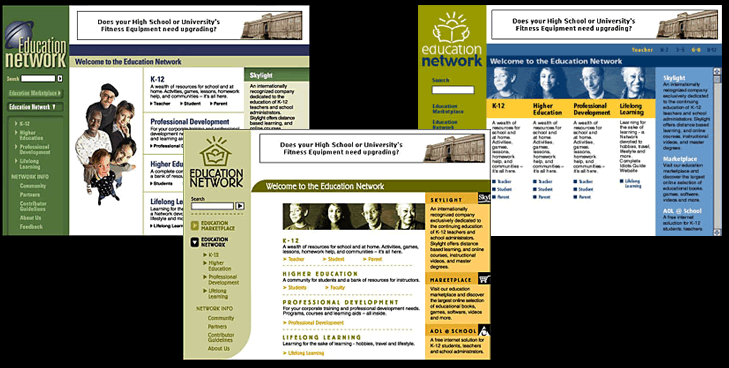
This
website was developed for teachers – a network of information for
all levels of learning and teaching. We weren't sure how best to speak to
a variety of demographics within teaching, so I did some variations. Shown
here are three concepts that explored the different visual and stylistic
ways that we might communicate to the audience. The one on the left was
too serious and the photography too funky. The center one was too fun, not
serious enough. They chose the one on the right. (Architect, Designer, UI/UX,
Photo-Illustrator)
|
|