DUTCH
BILL CREEK
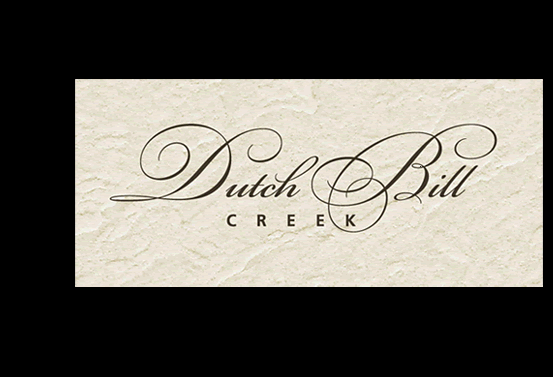
| This
is a redesign of a ten-year old wine label. The script used on the original
label was out-dated, and overused, so I turned to Bickham Script —
a rendition of a very old typeface. But it didn’t work to just type
out all the letters. The lower case was too low, the kerning (space between)
too wide, and there were variations of the letters (with loops or without).
It finally came together after much futzing around. And try, if you will,
to center block type under such elegant action going on above it all. Tricky. |
||||||||||||||||||||||||||||||
|
||||||||||||||||||||||||||||||
|
|
||||||||||||||||||||||||||||||
| DUTCH
BILL CREEK
|
||||||||||||||||||||||||||||||
| Dutch Bill Creek, o c c i d e n t a l , c a : Vineyard & Winery | ||||||||||||||||||||||||||||||