LIVINGSTON
|
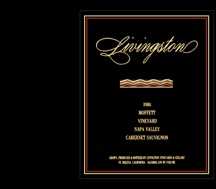
The black label with gold foil. It has had its day and will most likely
come back. It is at its best on a white tablecloth in a high-end restaurant
– a great contrast. That’s why you’ll usually find a premium
estate label in black – those that are marketed directly to restaurants
– while a standard label is white, which stands out on the shelf of
a wine shop. While this label seems almost elderly today, I still like it
because I love the people I designed it for. |
||||||||||||||||||||||||||||||
|
||||||||||||||||||||||||||||||
|
|
||||||||||||||||||||||||||||||
| LIVINGSTON
|
||||||||||||||||||||||||||||||
| Livingston Vineyards, n a p a , c a : Vineyard and Winery | ||||||||||||||||||||||||||||||